
The Challenge
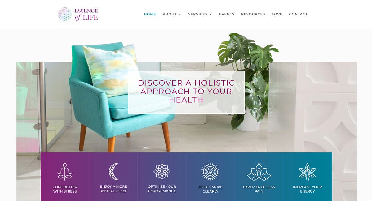
Maureen had a thriving in-person practice, but her online experience wasn’t reflective of the beautiful and relaxing vibe of her gorgeously designed clinic, and her patients were letting her know!
EOL had accumulated years of “brand debt”; a variety of resources, assets, and forms had varying levels of consistency, from fonts to content style.
Streamlined Operations
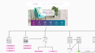
We helped Maureen imagine new ways to serve her audience, improve her intake process, and leverage her time, making better use of digital tools and assets, and streamlining her internal processes to reduce administrative time.
Redesign Patient Journey
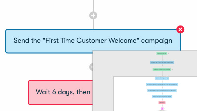
We re-engineered the entire patient experience from end-to-end, including email marketing systems, patient onboarding, education, and resources, and redesigned her design assets to unify the style across all touch-points.
Personalized Content Strategy
We transitioned Maureen away from using stock content and assets into a personalized content strategy that would make better use of her personal strengths, be more sustainable, and resonate much more deeply with her audience.
“I’ve worked closely with Oki Doki over the years as my strategists and designers, and I truly adore both Marie and Ben.
They helped me bring my vision to life in a way I don’t think anyone else could have. They’ve completely leveled-up my online presence! I can’t wait to cook up more ways for us to work together!"
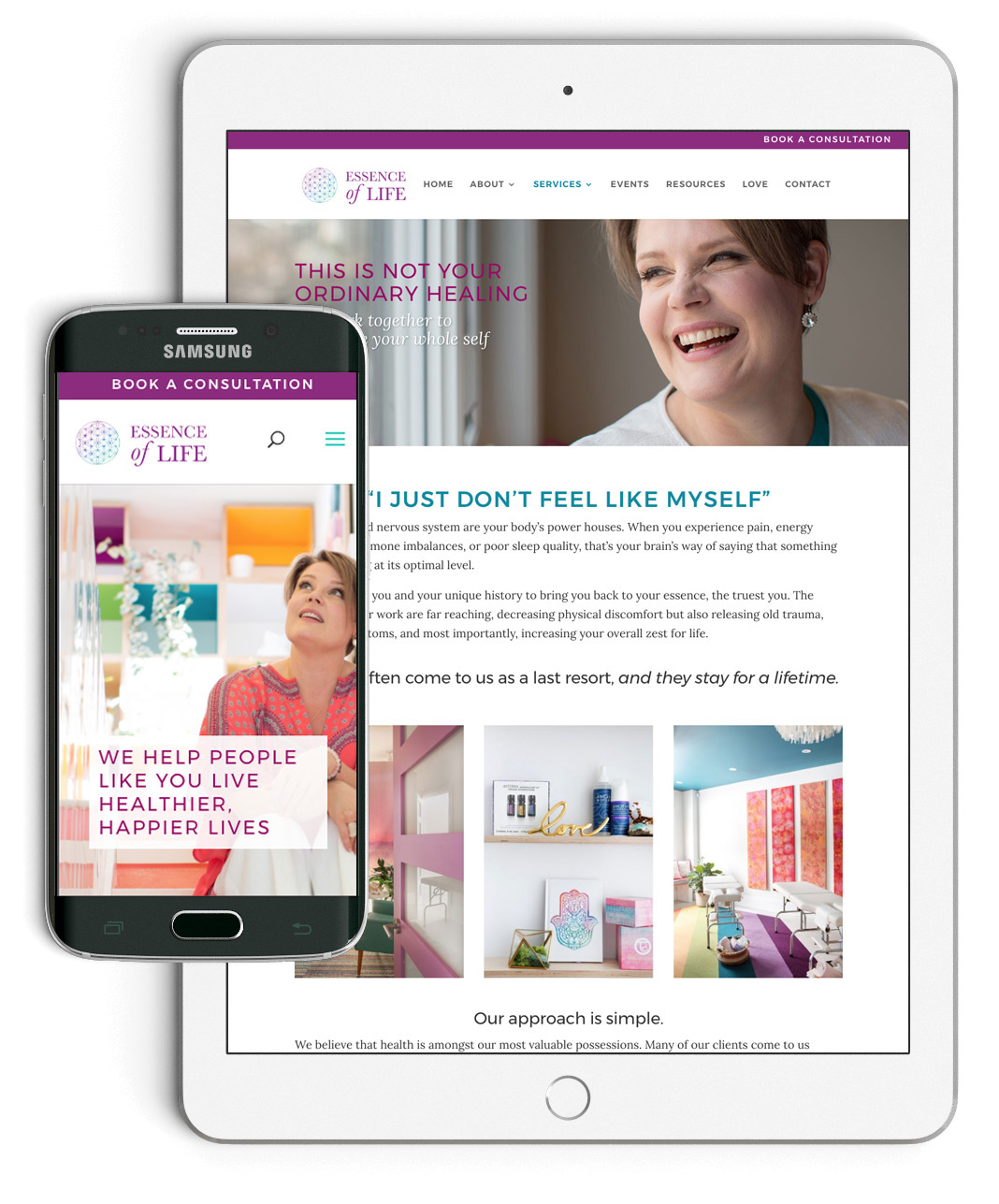
Building a Brand Voice
The Essence of Life clinic is anything but ordinary. The existing website at the time was standard, corporate, and serious; not at all reflective of Maureen’s unique approach and personality.
Maureen had loyal clients who had been with her for over 15 years.
Patient feedback showed that the majority of people coming to EOL were there to see Maureen, and we knew that we needed to bring more of her joyful spirit and humour into the brand voice, website, and across all of her materials.
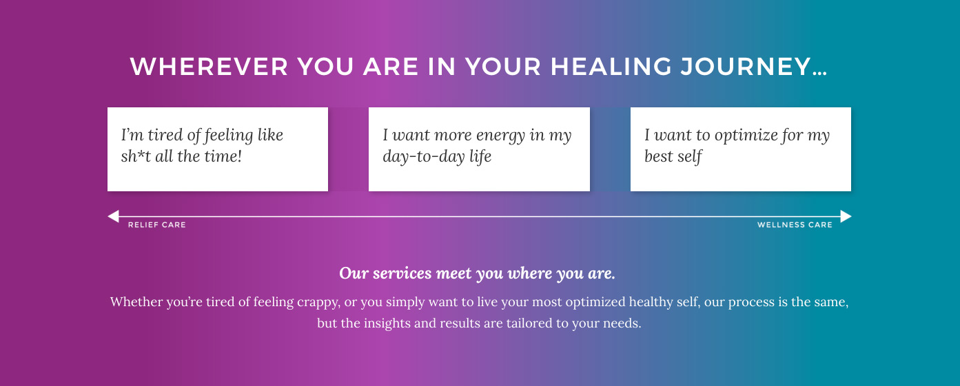
Speaking their Language
During our research we identified a few different stages of patient journey that influenced how Maureen would speak to her patients. When we asked her to relay what her customers say, “I’m tired of feeling like sh*t all the time” was something Maureen said she heard all the time.
Instead of beating around the bush with clever copy, we recommended pulling real, honest patient phrasing into her website and email campaigns.
Not only does the new copywriting better connect with patients, but it’s much more aligned with Maureen’s down-to-earth approach.
A Gorgeous Redesign
Color. Photography. Customer Language. Personality.
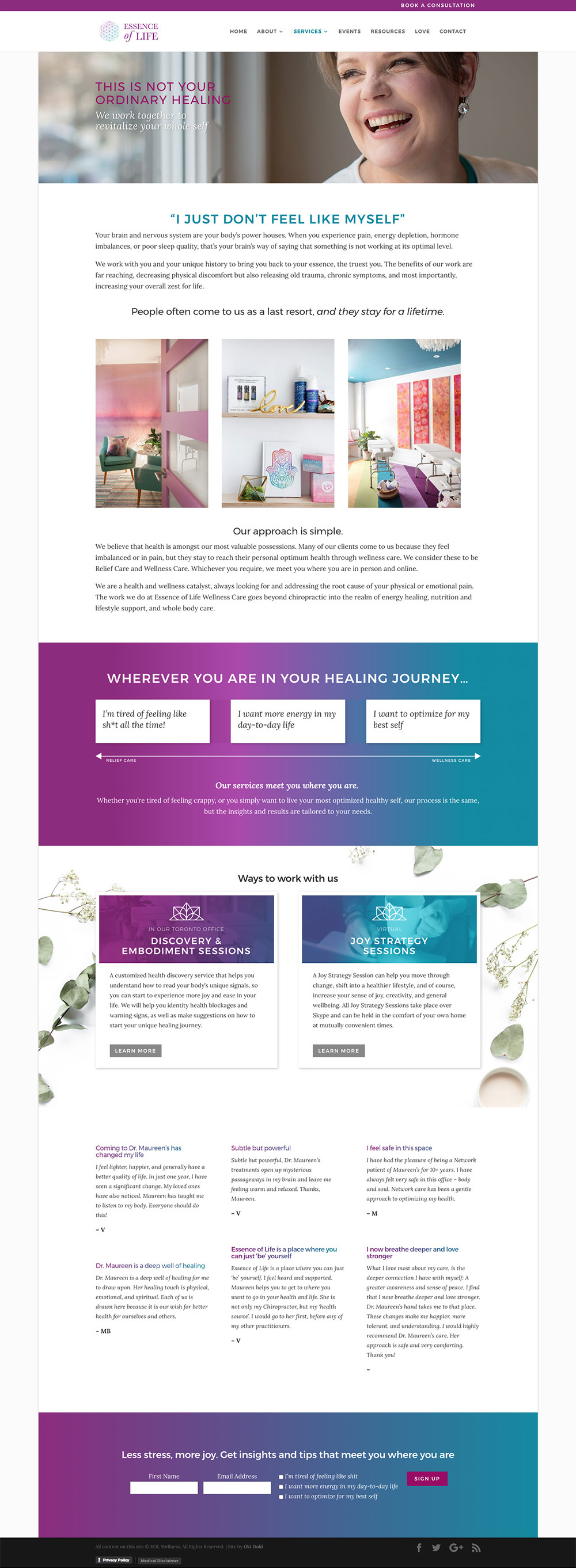
We redesigned EOL’s website to better showcase the physical space of the clinic, which was much closer to a colorful, contemporary wellness spa than a stuffy, corporate space. Maureen had professional photos taken of the space, which gave us plenty to work with.
We ensured that each element of the online experience was reflective of the in-person experience.
A Customer Education Hub
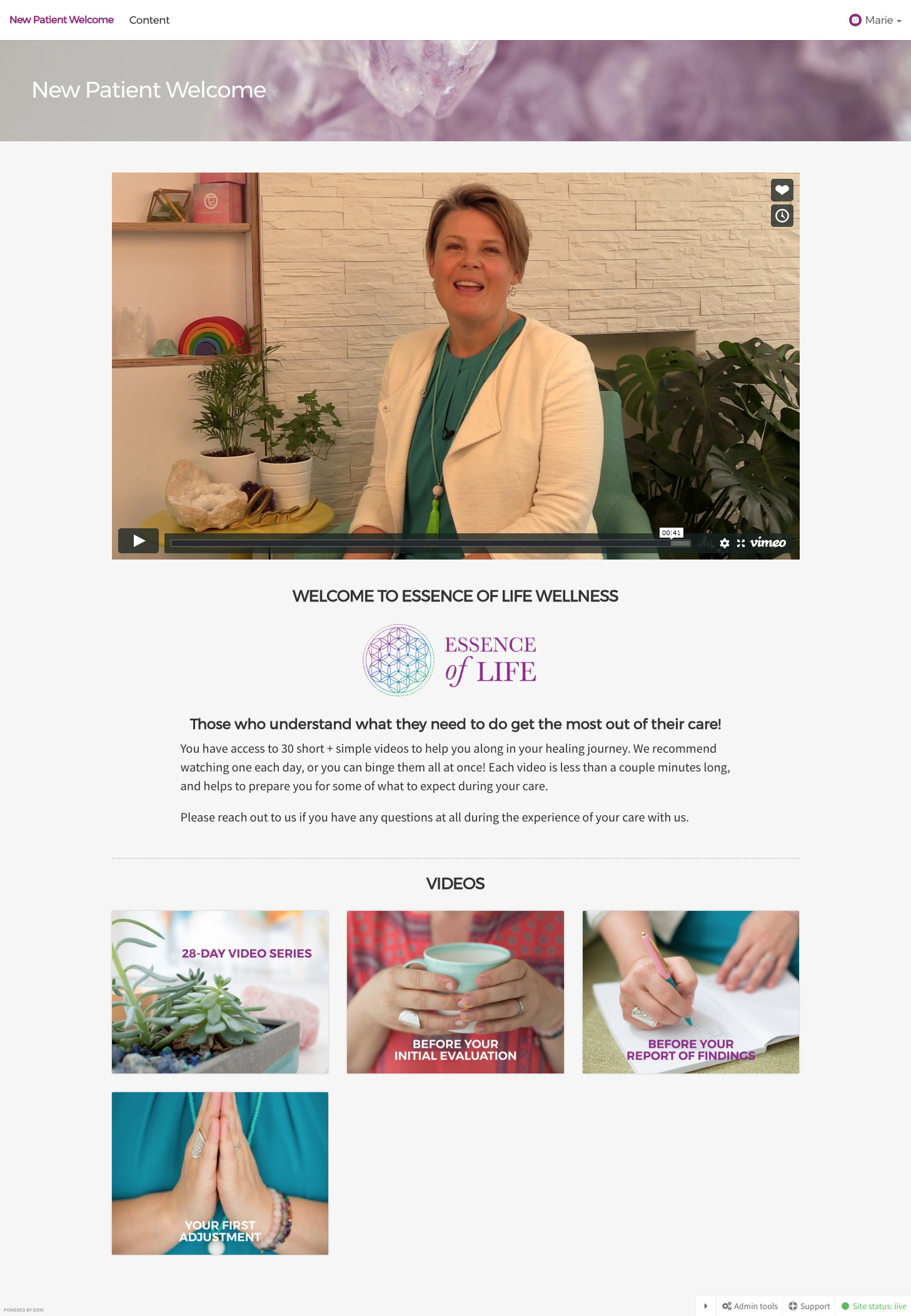
One of the opportunities we identified was a resource to help existing patients follow-through on their recommendation plans. In order to sustain long-term wellness, we need small wins and the ability to form habits that stick. We created a wellness hub and emails campaigns for new and existing patients to help both educate and empower them to create sustained change.
We used advanced automation and tools to help Maureen deliver appropriate resources to right patients at the right time, and the ability to track her patients behaviour and engagement with the new tools.
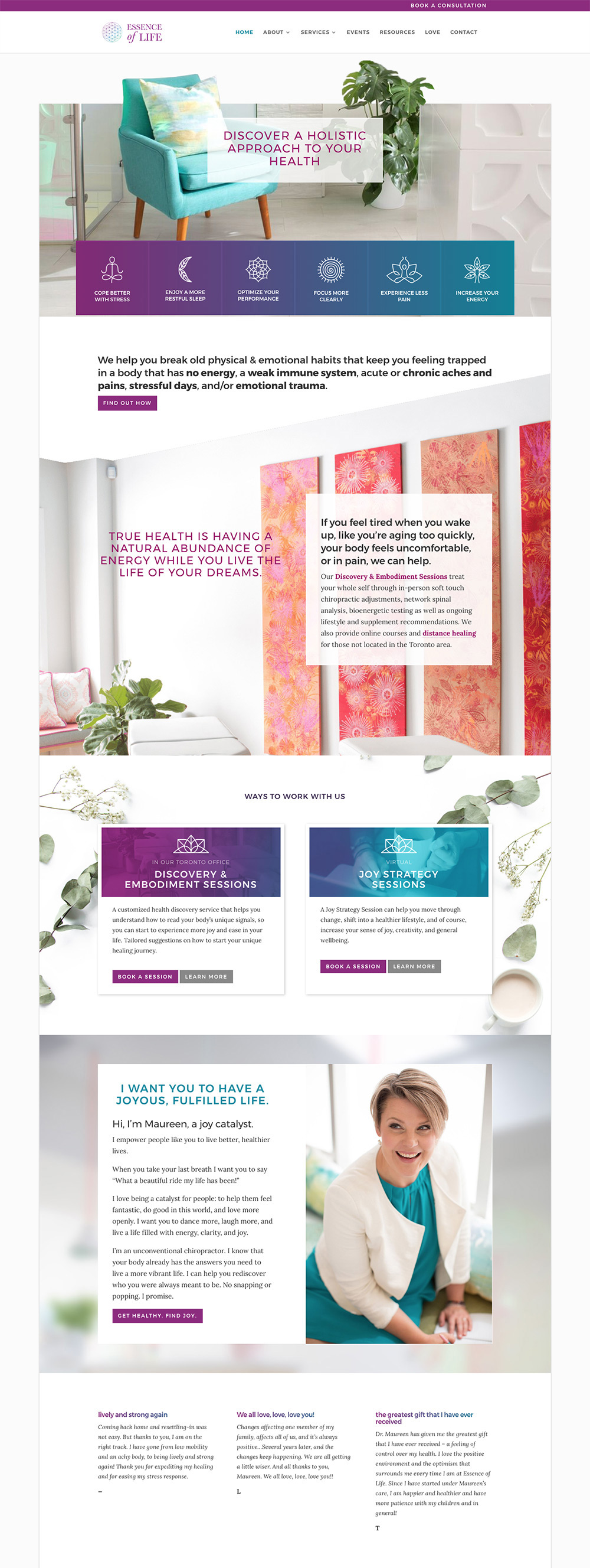
Beautiful and Functional
Essence of Life now has a beautiful and unique online presence, marketing systems and automation, and an online hub for both new and existing patients that’s easy for her and her team to manage and can grow with her as her needs grow.
TL;DR
What it was
A full-scale redesign of the entire online customer experience, website, brand voice, and admin operations behind the scenes.
What we did
Website design, development, product + service strategy, service design, marketing + email automation, content strategy, user experience design.
Why it worked
We used customer research and insights to guide our strategy, design, and customer journey in order to design an experience that was consistent, easy, and beautiful across all touch-points.
Want to collaborate on a project like this?
Tell us a bit about your project and let’s bring your idea to life!
